7 Marketing Design Trends to Watch
Thursday, May 1, 2014
by Stephanie Orges
Marketing
7 Marketing Design Trends to Watch
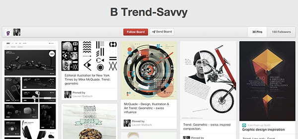
See the trends on our Pinterest board.
Visual arts are vital in marketing – but they go beyond catching the eye and relaying a message. Your choice of color, type and imagery conveys your brand personality, indicating whether you’re sophisticated or whimsical, bold or conservative.
I talked to the experts – Balcom’s team of art directors – to get the skinny on the latest trends they’ve seen in the world of design.
Flat Graphics
Simple, colorful, flat graphics are on the rise in Web design, hearkening back to the Swiss Style from the 1950s. The minimalism makes Web design seem more user-friendly on the basis of being easy on the eyes. Will realism die with the flat trend? Or is flat design already passé? Art director Lauren says no: “I think there will be two families on this moving forward and both will always be active.”
Geometric
Flat’s cousin (also a nod back to the constructivist Bauhaus and Swiss design styles), geometric tends to be simplistic, but sharper and more angular than flat graphics. The style often relies on patterns, and you’ll see it used, not just to promote color, but as a way to merge photo and type (it’s also popular on the home décor front right now).Geometric, in turn, is a stepping-stone to the low-poly approach:
Low-poly
Low-poly reflects the flat look, as it removes all texture from the image, but it retains a very geometric three-dimensionality. Art director Jeff comments that low-poly has been trending for the past few years, and he expects it to continue its streak.
Double Exposure
Double exposure superimposes one translucent image over (or within) another. It’s a unique and beautiful take on regular-old photography. As Jeff says: “The beautiful title sequence for True Detective reminded everyone just how powerful and downright cool this technique can be.”
Custom/Hand-drawn Type
The hand-drawn “movement” is really a revitalization of the craft and art form of typography creation. Designers and illustrators use this style as a way of branching away from the purely digital form of creation. With so much of a designer’s day centered around a computer screen, it's a nice change of pace to return to the pencil and paper. It's a release from the restrictions of what another person created, and a way of thinking about a set of words as one whole piece rather than various individual pieces arranged together.Some typographers to watch: Sean Wes, Jason Carne and Thomaz Biernat.
Unique Paper Choices
Although digital is becoming more dominant in the design industry, nothing beats the tangible joy of a high quality print piece. Suede-like matte finishes are trending over glossy paper, along with extravagant treatments such as foil stamping, spot-UV, die-cuts and letterpress.We’re seeing the trend across business cards, stationery, packaging and small paper goods.
Single-Page Web Design
Stop worrying about cramming all the important info “above the fold” on your home page: our interactive creative director and designer Brian says scrolling is in. In single-page Web design, all the site’s content fits on one long page, guiding visitors through a narrative as they scroll. You’ll often see parallax coupled with this design: a 3D effect created when objects in the foreground move at different speeds than those in the background.
How does all this fit together? Lauren comments: “While this is a generalization, and there are always exceptions, I see an increase in the divide between digital and print. The digital arena is going farther into the flat geometric approach while a lot of print and packaging is pushing into the crafted or illustrated.”
Tags: Web & Digital