Web Design Is Changing. Is Your Brand Keeping Up?
So here’s an alarming fact: If you don’t have a mobile-friendly site, you could be alienating the majority of your audience. About 56 percent of people visiting the top 10,000 U.S. websites are using their phones or other mobile devices to do it, according to a recent report.
But what does mobile-friendly really mean? Ever since the iPhone’s 2007 release, when browsing the internet via cellphone became the norm, designers and developers have been facing a whole new set of problems to figure that out.
Problem No. 1: Smartphones
Your desktop-sized website won’t look right on a phone screen. You can’t just scale down the site; it would be too tiny to read. And you can’t expect people to side-scroll; it would take forever just to read one paragraph.
So developers created the mobile site – a separate version of a website designed to fit the smaller screen. It meant extra work, but it also meant we could cater to the unique needs of the mobile user.
Problem No. 2: Tablets
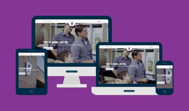
When tablets appeared, suddenly the variety of screen sizes meant that designing a different site for each one was impractical, if not impossible. Developers started switching to responsive design – meaning the content of the site can self-adjust to the size of your screen. This also requires extra work, but it means your website will work on a screen of any size.
Problem No. 3: Fluid has its limits
Responsive design that’s 100 percent fluid comes with its own complications: If you take the content from a wide rectangle and squeeze it into a skinny rectangle, weird things can happen. That nice, neat paragraph with the perfect line breaks gets pretty awkward.
Plus, another important fact:
Mobile users want different things out of your website than desktop users do. Mobile users spend less time on sites and visit fewer pages than desktop users – generally because they’re trying to get the necessary info as fast as possible and then move on. Which means a site that’s just a mini version of your desktop site might not be good enough.
The best of both worlds
Now, developers are using breakpoints. Once a screen size reaches a certain point (like the size of the average smartphone screen), it switches to a design that’s specific to that screen. This allows us to customize for mobile, even targeting large resource hogs such as background video that might slow down your phone, and reducing them, or – if they don’t include critical information – removing them.
As coding languages such as HTML and CSS evolve, 100 percent fluid becomes more viable. But for now, Balcom uses a mixture of both fluid and breakpoint design. We use breakpoints for larger screens and then switch to fluid when we go to mobile, which has the largest variety of screen sizes.
Line breaks can still cause problems, which means more time perfecting the design and programming, but this method offers the greatest flexibility, customization and overall user experience.
Is it really worth the extra work – and cost?
Sure, responsive design requires additional design and coding time – which means more money. But while your website is going to take up a bit more of your marketing budget, it’s also going to accomplish a lot more for you.
Websites aren’t just digital brochures anymore; they are hubs for every other marketing initiative you launch. Direct mail, radio commercials, Facebook posts, earned media – it all points people to your website, where they can read reviews, find locations, buy products and sign up for the e-newsletter. Responsive and breakpoint design mean you and your users get a flexible site that will work across the board for years to come.
Want a website that does all this? You’ll need both developers and designers who are familiar with the process. And wouldn’t you know it, Balcom's got those.
Tags: Web & Digital