Balcom's Top Websites: 2017
Friday, January 12, 2018
by Brian Blankenship
Marketing
Balcom's Top Websites: 2017
From designing the layout to writing the content, from coding the front-end to hosting it on our own servers, Balcom builds custom websites from the ground up. Here are a few of our favorite projects from 2017.
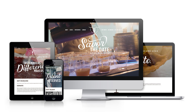
North Texas’ most celebrated cuisine and beverage festival needed a website to match its sophistication, fun and flavor. In addition to rebranding, we designed a site that differentiated and clarified the five unique events taking place over the three-day festival – writing fun headlines, shooting atmospheric video and incorporating gorgeous food photography to illustrate the energy of the festival as a whole.
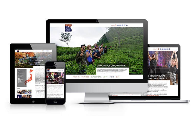
Fort Worth Sister Cities International
Fort Worth Sister Cities International is a fantastic organization that helps connect Fort Worthians with other cities across the globe, but a somewhat busy web design made it difficult for visitors to learn about each sister city and how to get involved. We simplified the layout and navigation, and found new ways to showcase each sister city using maps and beautiful photography the organization already owned.
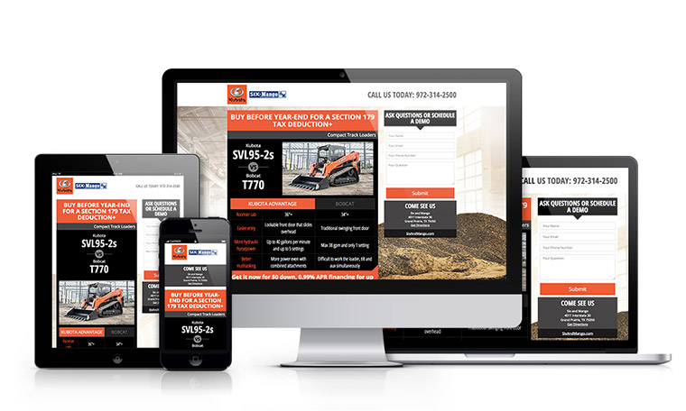
Kubota Digital – Unique Landing Pages for Display Campaign
We needed an efficient way to create ads and landing pages for dozens of Kubota agriculture, turf and construction products, and be able to customize each for individual Kubota dealerships. Our solution for the landing pages was to build a template system that could automatically pull unique information from hundreds of dealerships. We updated the same project for 2018, shown here.
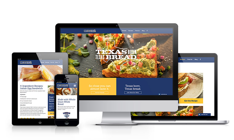
Mrs Baird’s Bread is a fresh brand that had an outdated website. Its strong marketing and social media efforts needed the complement of an online hub to funnel visitors towards in-store purchases. To save the client money, we used a website we’d designed for one of their sister brands as a template, borrowing its layout and navigation but using imagery and content unique to Mrs Baird’s.
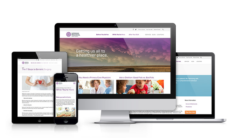
Norman Regional has been growing as a health system for some time, and with all the additions, the website had become crowded and difficult to navigate. We designed a fresh new layout and reorganized the content to be more intuitive for visitors, framing the main navigation around the information patients need before, during and after their visit, and shifting content for staff and students into a secondary navigation.
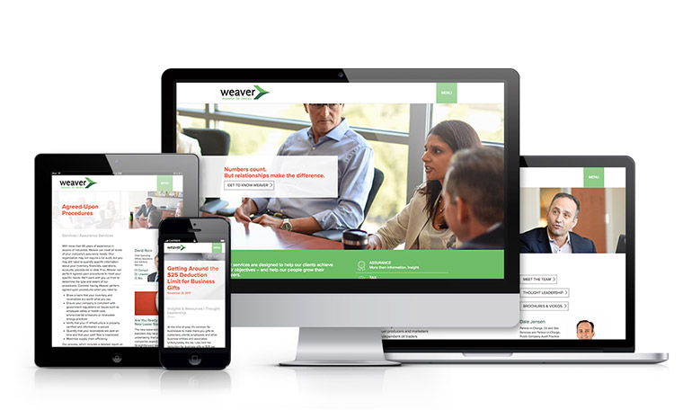
Thrilled with the cutting-edge masonry layout we designed for them in 2013, accounting firm Weaver came to us again when their website was ready for another refresh. We streamlined content that had become cumbersome and created a new takeover navigation that allows visitors to find what they need faster. The site still showcases Weaver’s content, while devoting more time to the firm’s identity and culture.
Tags: Web & Digital