10 Signs Your Website Needs a Spring Cleaning
Tuesday, March 17, 2015
Marketing
10 Signs Your Website Needs a Spring Cleaning
When something belongs to you, you see it differently than other people do – simply because you’re emotionally connected to it. Like, for instance, your newborn child. In your eyes, they’re beautiful. Someone else’s vantage point: Eh, kinda ugly. The same can be said for your website.
Step back and take a good look at your website. If some of these are true for your site, it’s time for an update.

1. It’s not responsive
Your website should have responsive design, meaning the layout adapts to whatever device it’s viewed on (iPhone, tablet, etc.). Pinching and zooming a screen to see content is tricky, even for those blessed with petite, nimble fingers. But take into consideration those with chubby sausage fingers – it’s really not fair to them.
2. It’s hard coded
If your website isn’t built on a content management system (CMS), that means you’re still relying on a programmer to make updates and edits. While coders are integral to your business, it is very easy for the average human to edit a website in CMS. With the exception of my dad – he’s still trying to wrap his head around group texts.

3. Pages/videos load slowly
You have a maximum of three seconds for your information to load before nearly half your audience abandons your website. Instant gratification, people. This is the world in which we live.
4. Text is in graphic form
Whelp, despite the technological revolution, search engines can’t read graphics, so it’s detrimental to your search engine optimization (SEO – the visibility of your website in search results) to have your info in graphic form – unless you’re using Google Fonts, which are searchable as text and offer visually unique options.
5. It’s over 5 years old
Besides the 10 signs listed here, your website needs a refresh every five years. User habits change. New devices launch. Technology advances. It’s like that actress who looks 40 but is really 80 – she doesn’t look that way without a little lift here and there along the way.
6. It utilizes Flash
Flash isn’t supported anymore. Get rid of it. It’s not easily compatible with mobile devices. It’s a resource hog. It drains batteries. It’s time to get JavaScript.
7. There’s too much content
It’s fine for your site to have a lot of content – it’s how you present it that matters. If a page is still text heavy after condensing text, use pull quotes and imagery to break it up and add interest. If your website’s rivaling “Gone With the Wind” in word count, you better hope you’re the next Margaret Mitchell.
8. Photography is dated and tiny
It’s similar to a professional headshot from 1980 – the quality is poor, the sense of fashion is outrageous, and the whole thing is laughable. If your website’s photography is outdated, small or mediocre, people are going to judge, possibly laugh, then jump off to another site.
9. It’s impossible/annoying to navigate
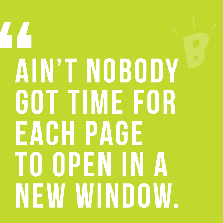
Organize the navigation concisely and clearly so users don’t get lost, confused or overwhelmed with too many options. Also, ain’t nobody got time for each page to open in a new window – that’s exhausting.
10. There’s no call-to-action
Your company has goals, and your website should reflect those goals with a call-to-action that’s easy to find. If a goal is to get people to call your company but users can’t find your phone number, that’s a major problem.
Like this? Read more:
Blog Author: Jennifer Haynes, Former B teamer