Spot the Differences in the New Star-Telegram Design
Thursday, October 8, 2015
Life
Spot the Differences in the New Star-Telegram Design
Last Wednesday, September 30, I walked into the office to find my fellow co-workers drooling over the newly redesigned Star-Telegram. Looking for a distraction, I nudged my way into the huddle to see what all the excitement was about. There in front of me were Tuesday’s and Wednesday’s newspapers sitting side-by-side and looking quite different from one another. When flipping through the newer paper, I stumbled upon Jim Witt’s brief explanation of the new layout on 23A. He confirmed the continued evolution of the newspaper across multiple platforms, saying they are focusing on legibility, photography and colorfulness.
From a quick glance, an everyday reader can identify the obvious changes: New fonts, a more breathable layout and a stronger sense of hierarchy and cohesiveness. Here are a few of the more subtle changes this graphic artist can appreciate:
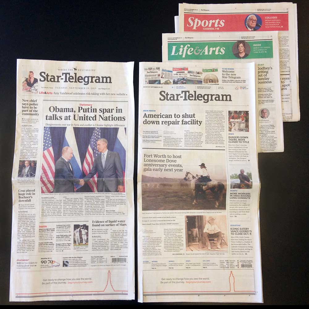
- Larger photographs give the eye a desirable focal point.
- A new color system adds life to the paper and helps with basic navigation: Blue for the front page, red for Sports and green for Life & Arts.
- Headlines now match the Star-Telegram logo font.
- Headlines have more breathing room, allowing them to stand on their own and have a sense of belonging.
- The heavens have opened and revealed the beauty of left justification. Can I get an Amen? This means cleaner columns without random gaps between words.
- While the paragraphs were changed to sit left, the highlights and smaller articles now rest on the opposite side of the page crease. With this rearrangement, readers can flip and scan much more easily and effectively.
In conclusion, I’d like to congratulate the Star-Telegram on the progress they’ve made. We look forward to the continued evolution of the paper and can’t wait to see what else is in store for readers.
Blog Author: Sarah Hamilton, Former B teamer