Rounding up Some of Balcom’s Favorite Logos
Wednesday, December 21, 2016
by Holly Aguilar
Marketing
Rounding up Some of Balcom’s Favorite Logos
A logo is more than just a font and a color; it’s a mark that has to exemplify your brand personality. Take a look at some of Balcom’s favorite logo projects from over the years, including several award-winning examples.
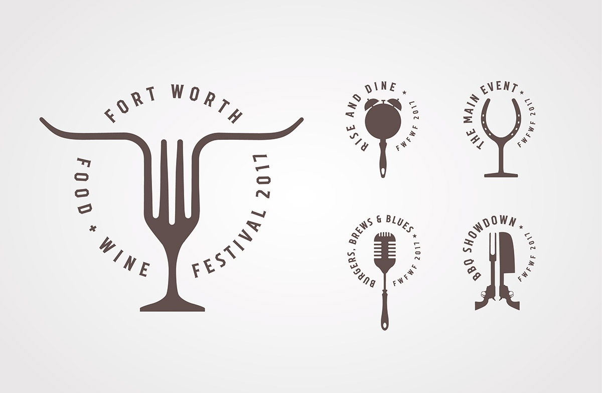
Fort Worth Food & Wine Festival
This logo combines fork, wine glass and longhorns for the Fort Worth Food & Wine Festival. We carried the hybrid concept through all the various events at the festival, creating a suite of logos that both complement and differentiate each other.
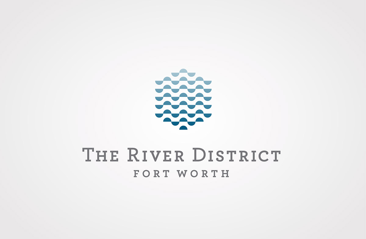
The River District
This new West Fort Worth entertainment and housing district is all about connecting the community to the river. Blue ombre waves form a hexagonal shape to invoke both the new architecture and its natural surroundings.
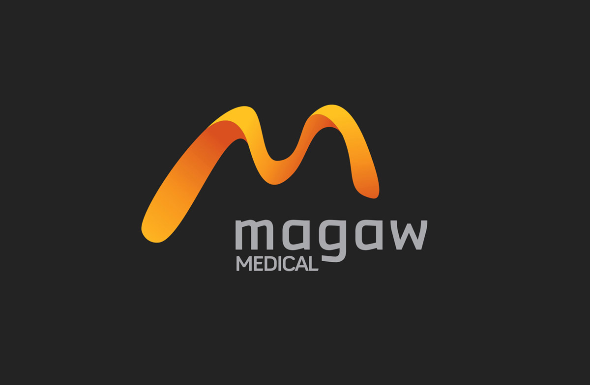
Magaw Medical
The flowing ribbon quality of the “M” in this logo hints at how easy it is to use Magaw’s low-cost, high-end video laryngoscope. Balcom designed the ribbon effect from scratch in Adobe Illustrator.
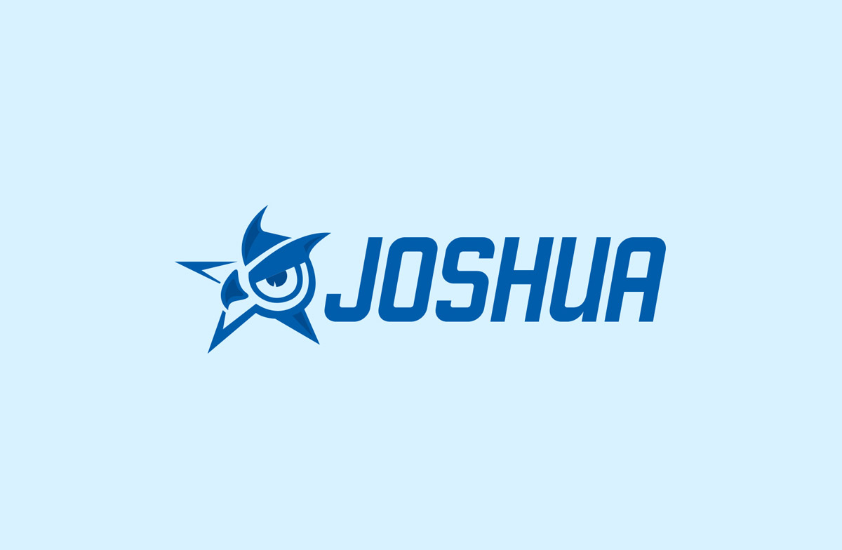
Joshua Independent School District
This logo seamlessly combines the school district’s Fighting Owl mascot with the city’s star icon and reinforces the district’s motto: “Excellence for all, from all.” It took countless sketches to get the logo just right.
(Featured in LogoLounge Sixth Edition.)
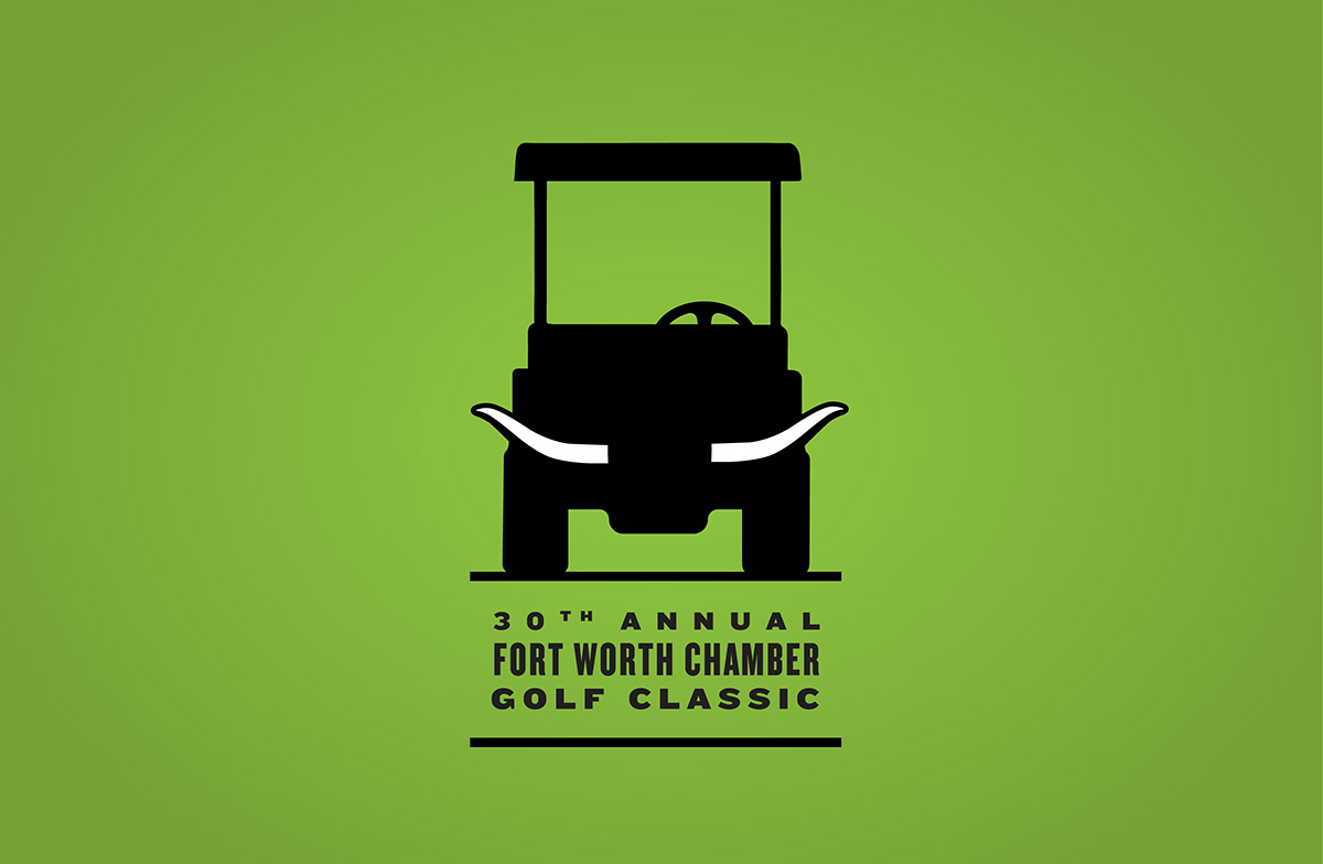
Fort Worth Chamber Golf Classic
For the 30th anniversary of the Fort Worth Chamber’s annual golf event, Balcom designed a long-horned golf cart motif – unique enough to stand out, but simple enough to be versatile.
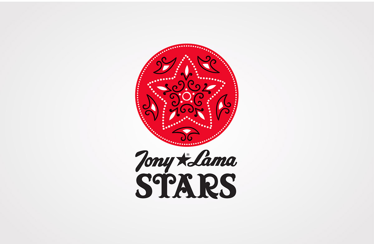
Tony Lama Stars
For a boot collection designed in partnership with the National Barrel Horse Association, Balcom borrowed a star from a classic red bandana to create a feminine Western logo that, like the boots, scoots stylishly from the arena to the dance floor.
(Featured in LogoLounge Sixth Edition and LogoLounge Master Library Series Shapes and Symbols.)
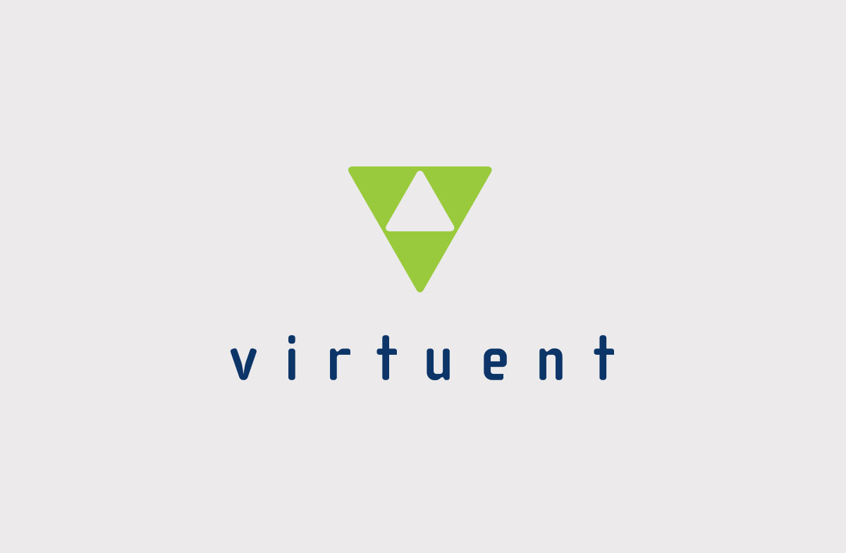
Virtuent™
Three triangles build onto each other to form the “V” initial for a creator of tape-on-disk technology that’s the engine for Bus-Tech’s award-winning Mainframe Data Library (MDL) products. Lime and navy colors and the sans-serif font create a fresh, clean look that suits the tech company.
(Featured in LogoLounge Master Library Series Shapes and Symbols.)
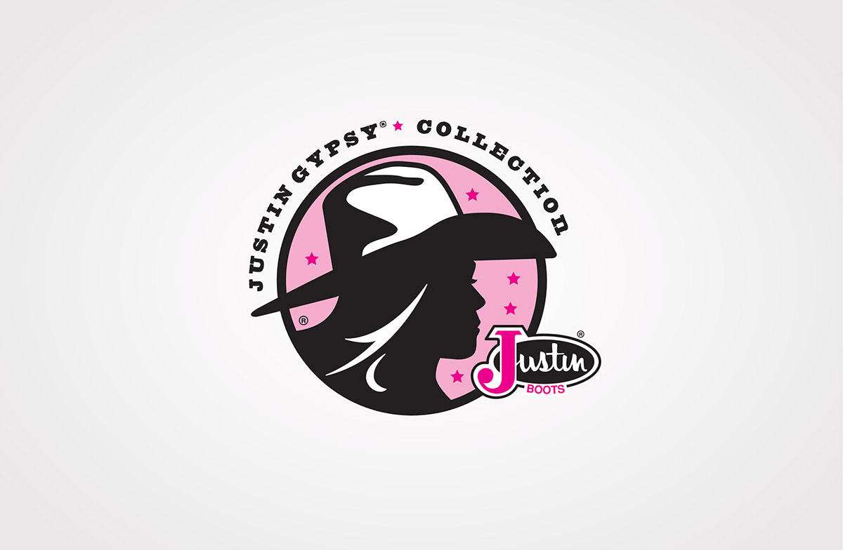
Justin Gypsy
The pop-art tone of the cowgirl silhouette in this logo for the Justin Gypsy Collection emphasizes a fashion-forward brand while paying homage to its roots.
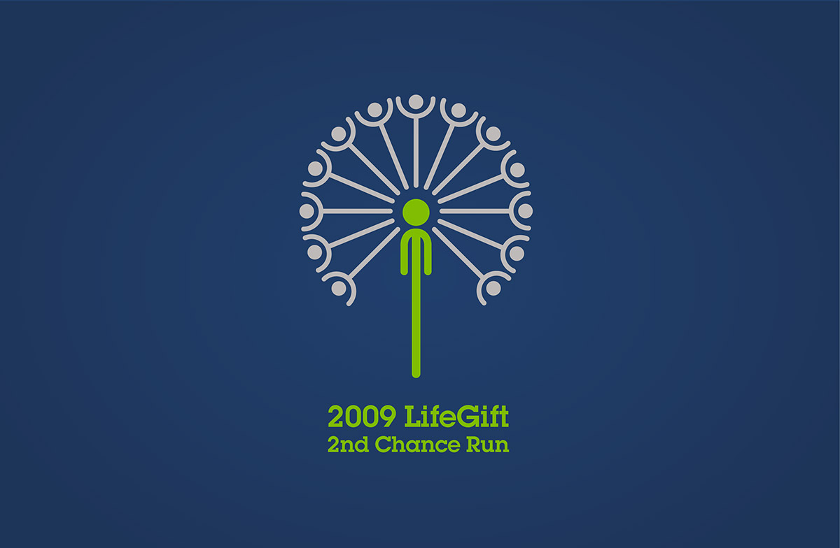
2009 LifeGift 2nd Chance Run
This dandelion graphic, used on a T-shirt for LifeGift’s 2009 charity run, combines the themes of new life and hope in a visual metaphor for the lives saved through organ and tissue donation.

Texas Health Resources
When Harris Methodist Health System and Presbyterian Healthcare Resources merged to form one of the largest faith-based nonprofit health systems in the U.S., Balcom created this woven icon with a subtle cross to represent the system’s strength through integration and faith.
Learn more about what it takes to design a logo.
Tags: Branding & Advertising