Fonts You Should NEVER Use – and What to Use Instead
Tuesday, January 24, 2017
Marketing
Fonts You Should NEVER Use – and What to Use Instead
Good typography often goes unnoticed, but bad typography rarely does. That’s because good font choices are easily legible and well-suited to the composition. If your viewer doesn’t have to think twice, then your font is doing its job. But if they have to squint or do a double take, or if it reminds them of a late ’90s chain email with sparkling angel illustrations and threats of global apocalypse for failure to forward, you might want to rethink your font.
But where do you start when choosing a typeface? And what makes a font bad? Here’s a quick guide.
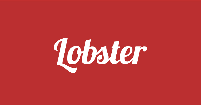
What’s Out: Kitschy Script
Fonts like Lobster, Deftone Stylus, Mission Script, and Pacifico gained a lot of popularity around 2010, but were quickly retired because they really only filled a niche market, and the chunky weight caused legibility to suffer.
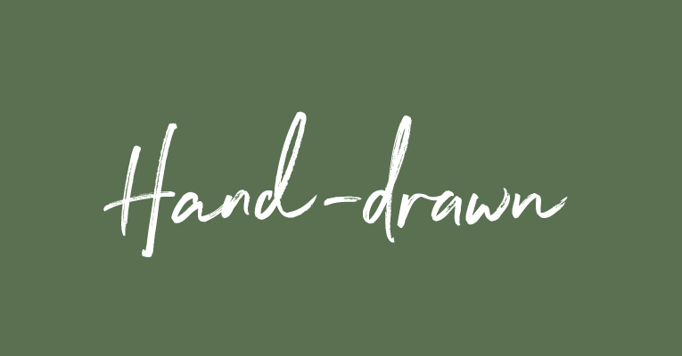
What’s In: Hand-Drawn Type
More often, designers are starting to create custom typography to suit their needs. Clients love having something to call their own, and hand-drawn type is often more interesting than a typeface that repeats the same supposedly hand-drawn character numerous times.
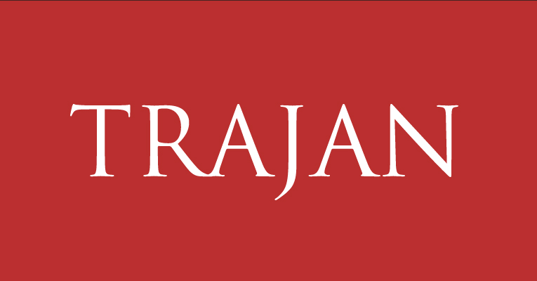
What’s Out: The Hollywood Font
Unless you’re the University of Kansas, stay away from Trajan. Designed to mimic Roman script, this font has been seriously overused on movie posters and in film festivals. While it may be an Adobe default, stay away from this one.

What’s In: Serifs with Character
Try replacing Trajan with a font like Jupiter, which has some beautiful, sweeping swashes; more weight variation; and tapered serifs. Another great option is Requiem, which features italic ligatures for a more romantic look and feel.
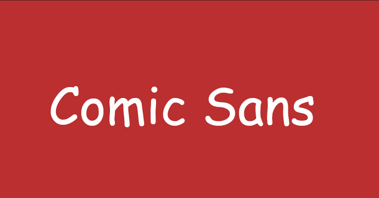
What’s Always Out: Comic Sans, Papyrus, Curlz MT and Copperplate Gothic
While font love (and hate) is largely subjective, there are some fonts that the design community as a whole wouldn’t touch with a 10-foot pole. I think we’ve all pretty much agreed that Comic Sans, Papyrus, Curlz MT and Copperplate Gothic belong on a fried hard drive, never to be recovered again.
What’s Always In: The Classics
A great rule of thumb to follow is that if it’s trendy, it probably won’t last. So if you’re looking for something to stand the test of time, stick with some of these well-loved options: Frutiger, Proxima Nova, Franklin Gothic, Garamond, Gotham, and Brandon Grotesque.
But if you’re me, you also hope Helvetica will find its way onto that fried hard drive.